


Problem Statement
Real estate has long been seen as an exclusive asset class—high entry barriers, lack of transparency, and limited access kept it out of reach for the average investor. Despite evolving investment behaviors, these systemic issues remained, making property investment complex and inaccessible.
For younger audiences, especially 20-somethings, real estate wasn’t even a consideration—entry prices were intimidating, and the process felt outdated and opaque. This growing gap between investor expectations and the industry’s reality created a need for disruption.
The Vision
Making real estate investing accessible to all using technology, data, and smarter investment models.
Data-Driven Asset Selection
We leverage real estate data to identify high-potential assets — ensuring transparency, smarter decisions, and lower risk for investors.
Affordable Entry with Fractional Ownership
With investments starting at just ₹5,000 (~$60), Aasthy breaks traditional barriers, making real estate accessible to young and first-time investors.
Smart Diversification with Strong Returns
Investors can diversify their portfolio across multiple properties and earn competitive returns of 12–18% annually, balancing growth and stability.
How I helped with the vision
Understanding business goals to crafting intuitive, high-conversion user journeys.
The early version of the Aasthy web platform had low conversion due to a poor first-time user experience — unclear content hierarchy, overwhelming information, and lack of clarity around the investment model.
My role was to reimagine the product experience so that users felt confident, informed, and excited about this new way of investing.
User Personas
Using the existing user data and behavior, ad-hoc personas were developed. Through user interviews and further data the previously made assumptions were validated and strengthened. User archetypes were discovered and this gave us the primary target group for our product as well as a secondary persona and those user types that were to be accommodated.

PRIMARY PERSONA
Archetype 1 : The Up-and-Comer: Thrifty, Idealistic, Tech-Savvy
CHALLENGE
Over-conservatism. Individuals in this group tend to be young investors, and understandably have a fear of the often unpredictable market.
STRENGTH
The up-and-comer is completely plugged in to the always-on digital world – comfort with technology is a given. As the world of investing becomes increasingly more digital, this group is ready to dive in!
OPPORTUNITY
Up-and-comers should keep in mind that it’s nearly impossible to grow their wealth without taking on some amount of risk.
SECONDARY PERSONA
Archetype 2 : The Accumulator: Efficient, Multitasking, Forward-Thinking
CHALLENGE
Accumulators can struggle to overcome their own to-do lists and find the time to manage or grow their investments. Most in the group are comfortable with technology, but some might be hesitant to give up the old ways of paper statements and one-on-one advising entirely.
STRENGTH
Accumulators are efficient. They’ll likely run with the right investing strategy once they can identify it and pencil it in to their schedule.
OPPORTUNITY
They have been instilled with the ideology that real estate is traditionally the best investment. This can be leveraged.

My major focus areas during redesign
User interviews revealed core problem areas in the product. Through iterative design and testing these areas were improved. Post-release data proved that the updates were performing significantly better.
Click a topic to view in detail

Help users navigate and explore the product easily
Navigation bar for web and mobile

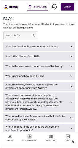
Help user understand who we are and how the product works
About us, FAQ's and story telling (2nd fold)


Deliver a great first impression with the right info & visuals
First fold of the landing page

Bing bong! Your latest investment just went live!
Notification feature and push notifications
SCROLL FURTHER FOR PROJECT DETAILS
Help users navigate and explore the product easily
NAVIGATION BAR FOR WEB AND MOBILE
The very first improvement that needed to be addressed was the pre-existing design of the navigation bars which had several UX as well as visual consistency issues.
BREAKING IT DOWN
Inconsistent elements in the bottom nav bar
Exploring a product becomes a heavy task if the navigation isn't smooth and consistent. The icon styles, spacing and alignment needed a complete revamp.
Most used features are not accessible
The core product offering (assets, real estate heatmap) are not quickly accessible when a user is on the verge of making a decision.


Understanding user behaviour for redesigning navigation
To do so, the user was explained about the task at hand. We asked repeat users to tell us their most used features on the product through a poll and what they found difficult in the current navigation.
RESULTS
With some iterations using the above poll results, the navigation bar was designed and tested for usability and clarity of the construct.
In the process of the Nav bar redesign, the following flows were also fixed
Empty state screens in logged-out user flows
Some features of the app were available only to the registered user. Previous experience would directly prompt login breaking the user flow abruptly. The redesign considered informing the user about the feature and a CTA for login
Introducing explore & dashboard tabs under investment
From the user interviews it was clear that a section in navigation should be dedicated to splitting investments into "current live assets" and "user investment dashboard" where all top actionable investment items could be easily accessed.
The support modal & the "profile click instances"
The big floating "help" which users found intrusive was replaced with a support icon in the top navigation. With addition of a premium feature, choose nominee etc, the profile card underwent a revamp as well.

PROFILE INSTANCES
LOGGED OUT STATE
LOGGED IN STATE
The empty states that previously led to login screen now informs user what the screen is about instead of breaking the flow of their exploration
All instances of the contents in the profile section at a given time
Features that are inaccessible in the logged out state is accessible through the same screens on the nav once the user has logged in.
Deliver a great first impression with the right info & visuals
REDESIGNING THE FIRST FOLD AND FLOW OF THE LANDING PAGE
With a new age concept that involved financials, it was very important to communicate the idea effectively and establish trust. Even the adventurous investor would be skeptic if their first impression was vague and sketchy.
APPROACHING THE PROBLEM
Key information about the product offerings
Deciding the content to be displayed such that the user would be fully informed about our offerings to pique their interest ( Targeted ads)
AB testing with two visual concepts
The core product offering (assets, real estate heatmap) are not quickly accessible when a user is on the verge of making a decision.

UNDERSTANDING THE PROBLEM
To understand the current problem areas, I worked with our data scientist for the current landing page analytics

KEY TAKEAWAYS
Analysing the data and speaking to existing users provided these insights and course of action henceforth
Unclear messaging
As a new concept, users were not clear on how it works as there was no mention of "fractional real estate" which was the core offering
Unconvincing visuals
The users who were shown this for the first time expressed uncertainty as the first impression didn't seem trustworthy enough to explore
Investment structure
How are we able to assure the range of returns given the situation of the current market
Not enough incentive to sign up
The users who did browse the page had enough to go on, and without an intent to invest there was no incentive to sign in
Iterations tested


Focus on Fractional Investment and listing locations

Brand value + Real estate focus including all offerings and metrics

Returns focussed with mention of fractional investment
The selected iteration was the one that was best received and led to maximum conversions.

Help user understand who we are and how the product works
ABOUT US, FAQ's AND THE STORY OF TRANSPARENCY
From the aspect of user acquisition, the next step was to further improve our credibility and justify our model of transparency. We received user inputs and they always suggested that users try to know more about us and our offerings after gaining an interest in our concept.
we do
we are
choose us


Designing the notification experience for Aasthy native app and web
NOTIFICATION CATEGORIES, PUSH NOTIFICATIONS
We had started to list about 2-3 assets per month and this meant that the number of email/ whatsapp notifcations would be spammy for repeat investors. The aasthy native app launch with a notification feature was the solution to keeping our users updated at all times without being intrusive.


CATEGORIZE
A card sort with colleagues
I looked into all the different kinds of notifications we currently send and all the future requirements and listed them down on figma.
I created colour coded sticky notes for category/ subcategory and content and conducted a hybrid card sort.
CARD SORT SNIPPET

RESULTS OF THE EXERCISE
Notification categories & behaviour
The card sort helped in categorising our notification types into 3 main types, and 2 subtypes.
Assigning icons to notification types
How are we able to assure the range of returns given the situation of the current market
Deciding user actions on notifications
Mark as read, delete and snooze were some options that needed to be considered for certain alert categories
COMPONENTS

RESULT
The finished notification experience
The notification feature was prototyped and tested with a small group of existing users who were instantly able to connect the previous messages and mailers to these new concise in-app notification.


IMPACT
Aasthy's user base increased from 108 in June 2022 to 7523 in October 2022 throughout the cycle of the feature releases. It helped ten thousands of investors understand the concept and diversify their portfolio, generating high returns. Sign ups, KYC's and investment numbers shot up exponentially.